Ormi is the only unified Web3 data layer to supercharge live, historical, and AI-powered blockchain data applications.
Problem Statement
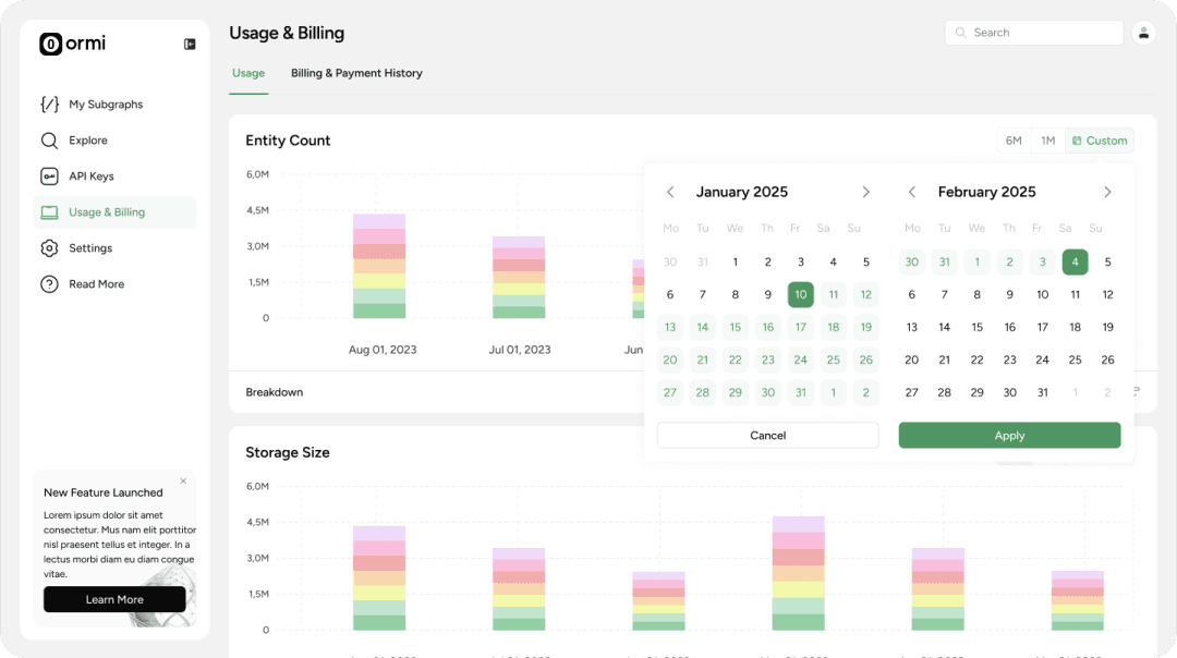
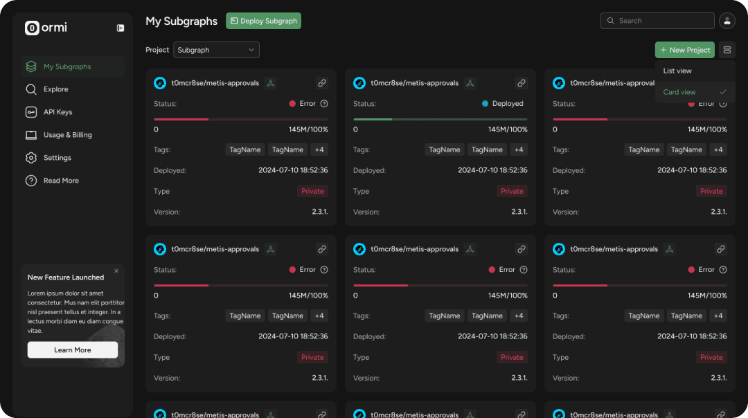
Developers need an intuitive way to deploy and manage blockchain data without getting blocked by complex and hard-to-use interfaces.They struggled to navigate the dashboard efficiently, leading to decreased productivity.
During User Research and Testing I finalized user flows for core user groups that helped to achieve next product goals: Increase time to launch subgraph, Reduce drop-off rate, Increase task success rate, improve user satisfaction and increase return visits rate.
My Design Process
As a founding product designer, I was responsible for driving the design strategy and crafting the user experience. I selected Double Diamond Framework for my work on this project.
Discover Phase
I was in crucial position to shape the user experience from the ground up. I utilized research-driven and user-centered approach.
My goal was to understand not just what tools they use — but why they choose them, where they get stuck, and what would make a tool like Ormi genuinely useful in their day-to-day work.
Context: I conducted research with mid-sized DeFi teams who are actively evaluating and implementing blockchain indexing tools such as Ormi, The Graph, and Goldsky.
Contrains: Early product maturity (Ormi had no fully developed interface — only dev-led wireframes),
Limited User Pool, Short timeline. In addition to that, users already used other tools.
Goal: Understand how these teams make adoption decisions, what friction points they encounter during implementation and how tools like Ormi could better fit their workflows.
Deliverables: User Research Summary Deck, Empathy Map, Affinity Diagram, Stakeholders' Playback Session, Design Priorities Brief.
Emapthy Map for emotional drivers and affinity mapping for groupping related insights and to uncover patterns and user motivations.This helped me clearly outline the main design objectives and select key metrics to evaluate design decisions in the end.
Design Formula = frictionless first-time UX + transparency and control.

Develop
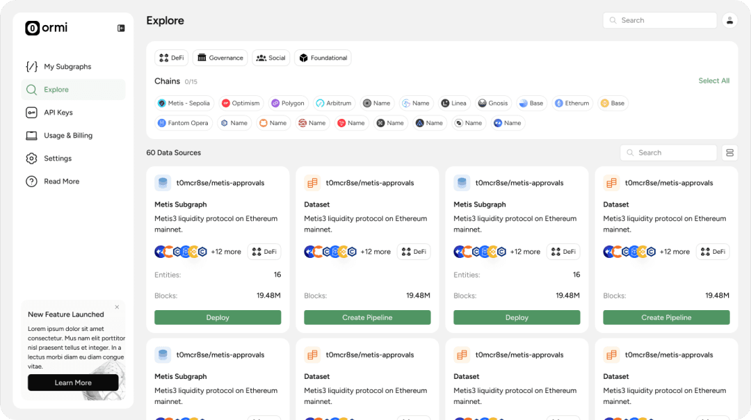
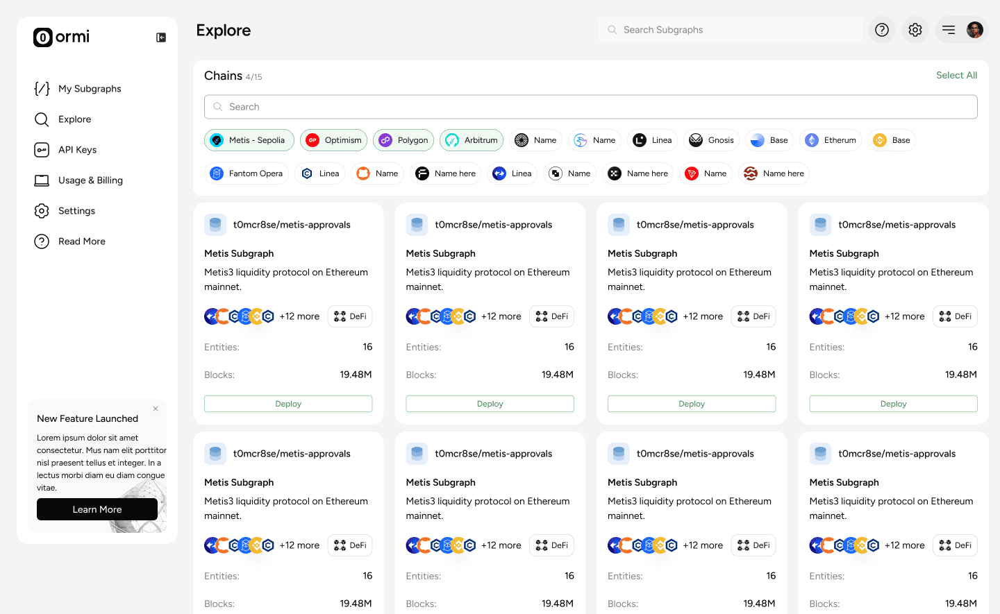
During Development stage I tested Explore Page with a 5 variants of Filters navigation pannel.
While task success rates were nearly identical across all variants, Version 4 showed a shorter average time on task, indicating a more efficient interaction. Version 2, which featured a left-aligned filter column, received higher subjective preference ratings—likely influenced by familiar UI patterns from competitor tools rather than actual performance.


Deliver
I prepared for devs hand-off clickable prototypes with established scalable design system using tokens/variables. I also conducted quick user walkthroughs. Feedback from these sessions guided further refinements — especially around Detailed Subgraph Page.


What Can be done differently?
Track behavioral patterns post-launch: Adding real usage analytics (like filter use rate or drop-off points) could help to validate design decisions.
Include first-time users in testing: Early tests focused on experienced users. Including new users would’ve helped validate intuitiveness.